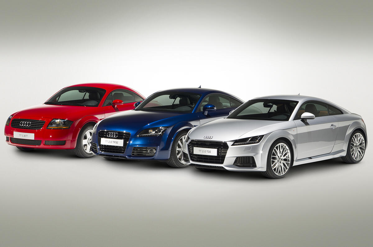
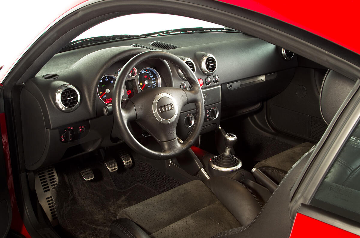
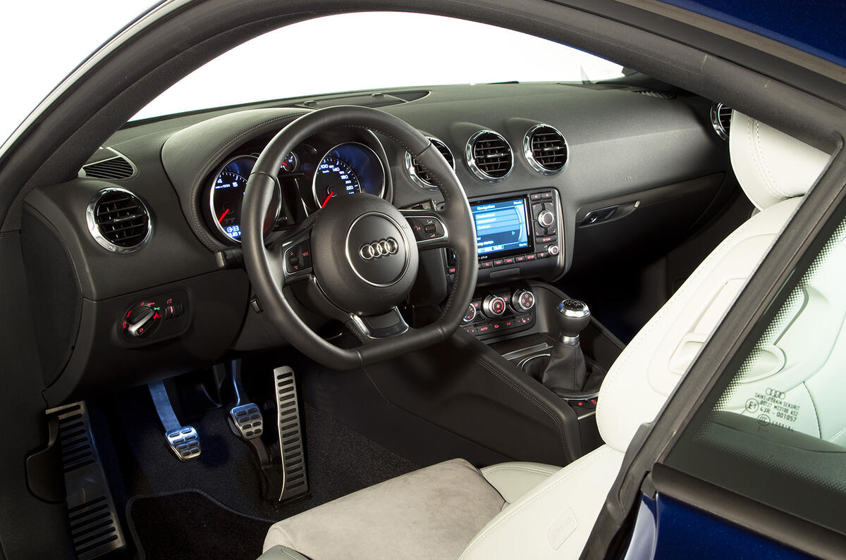
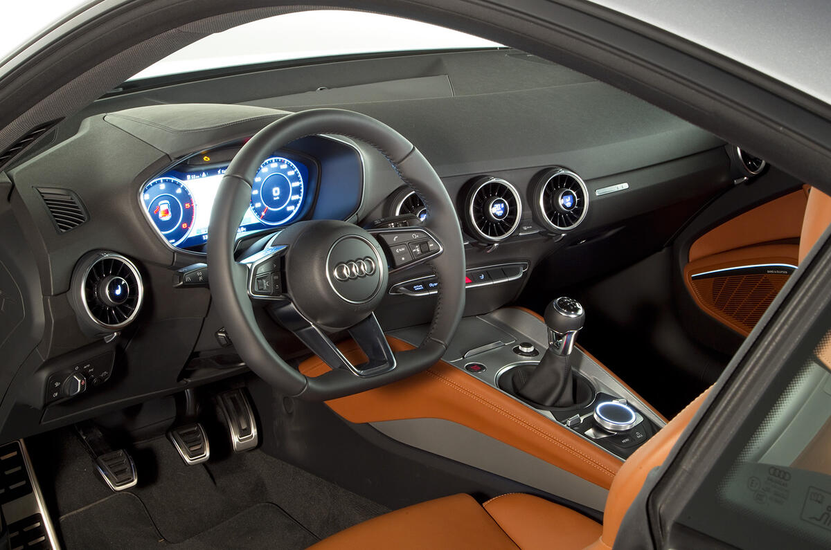
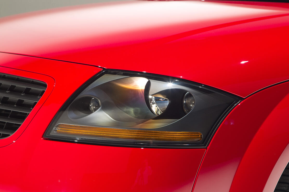
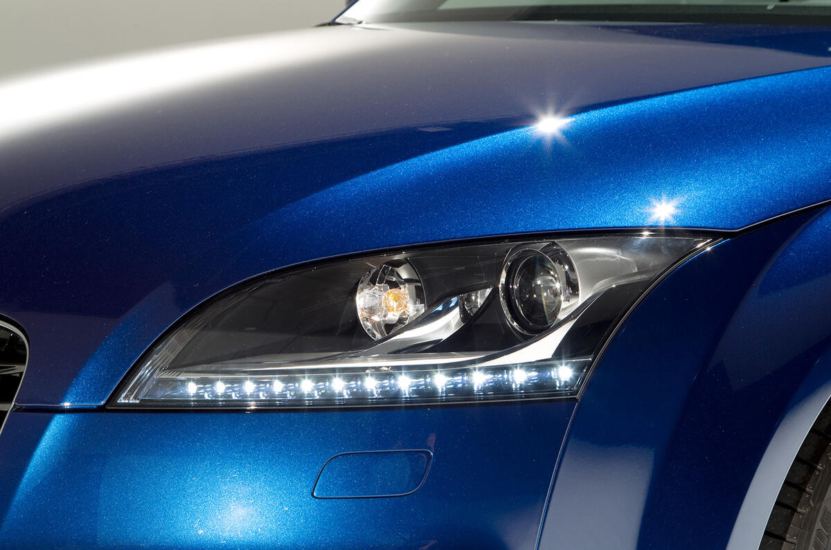
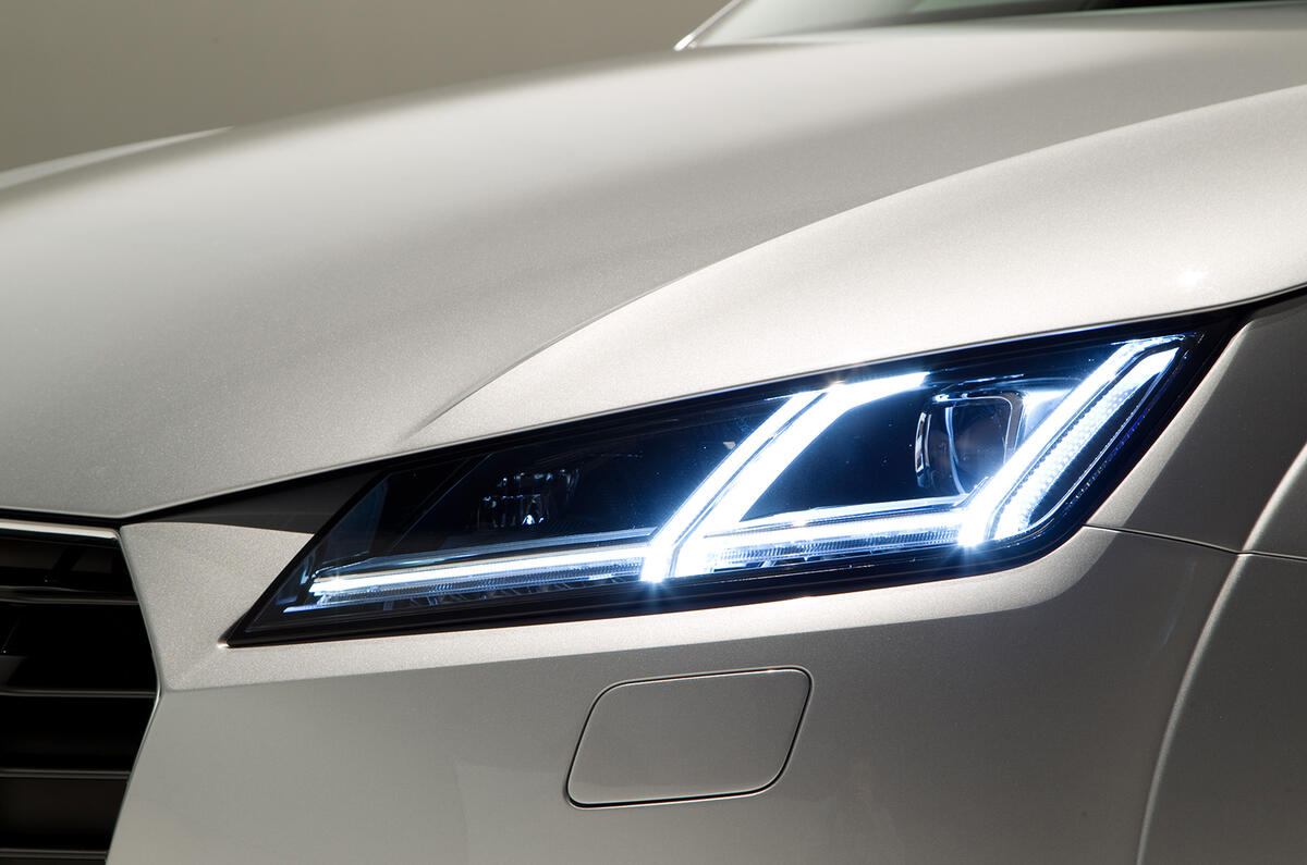
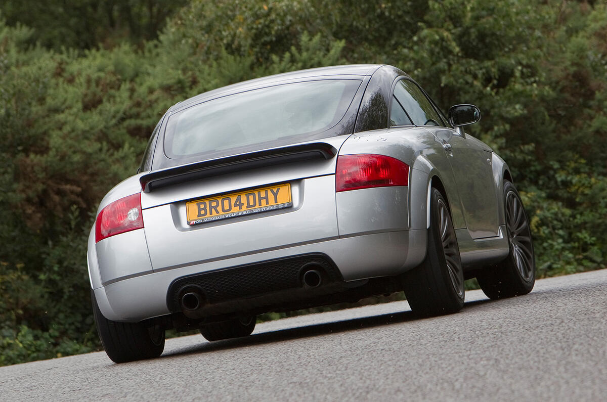
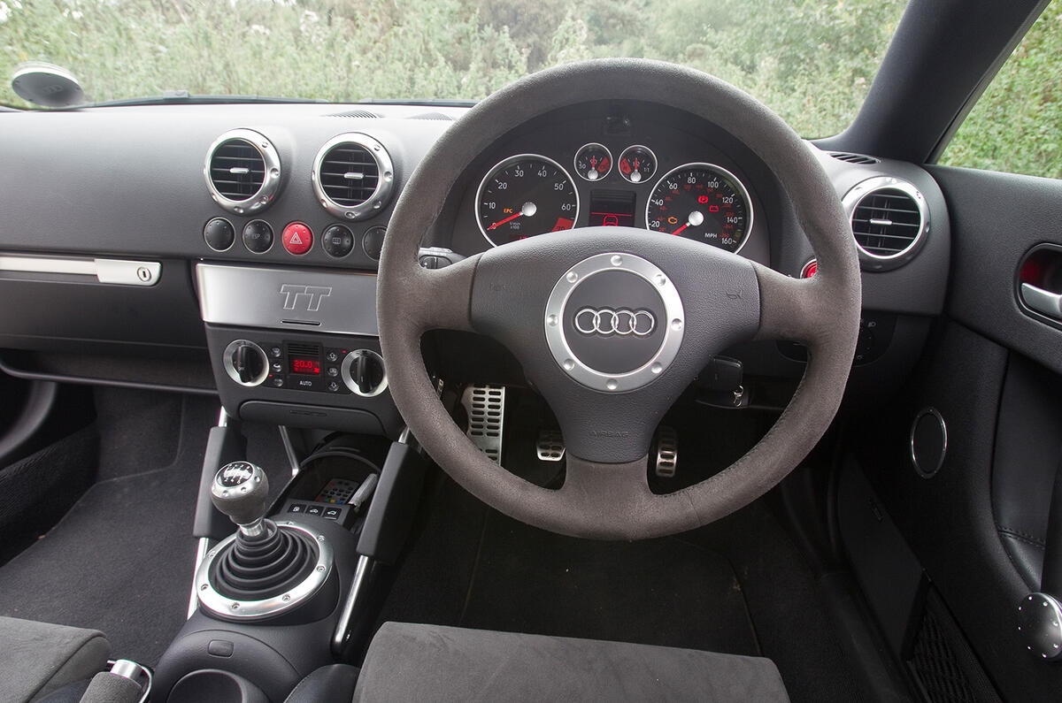
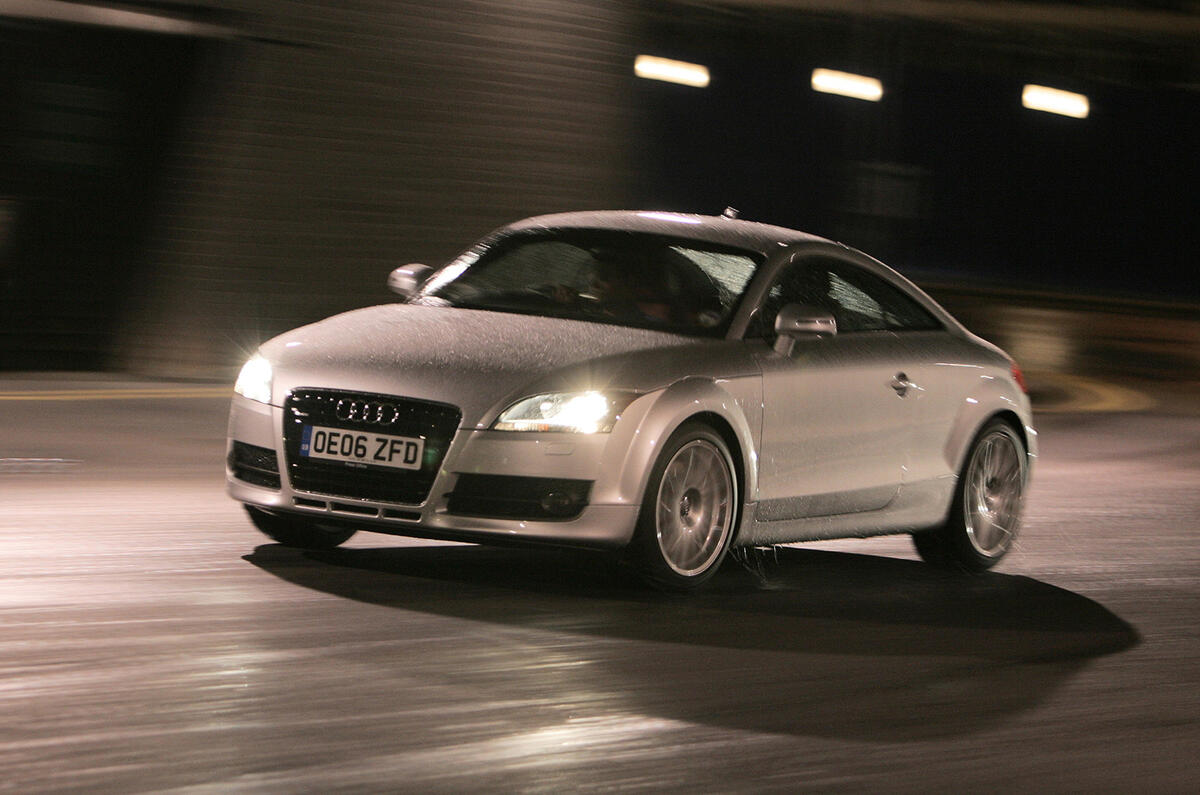
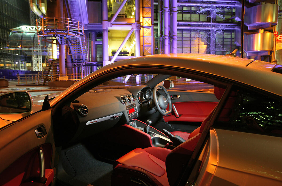
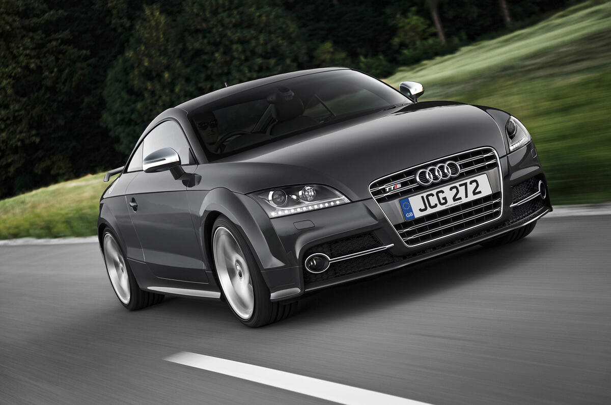
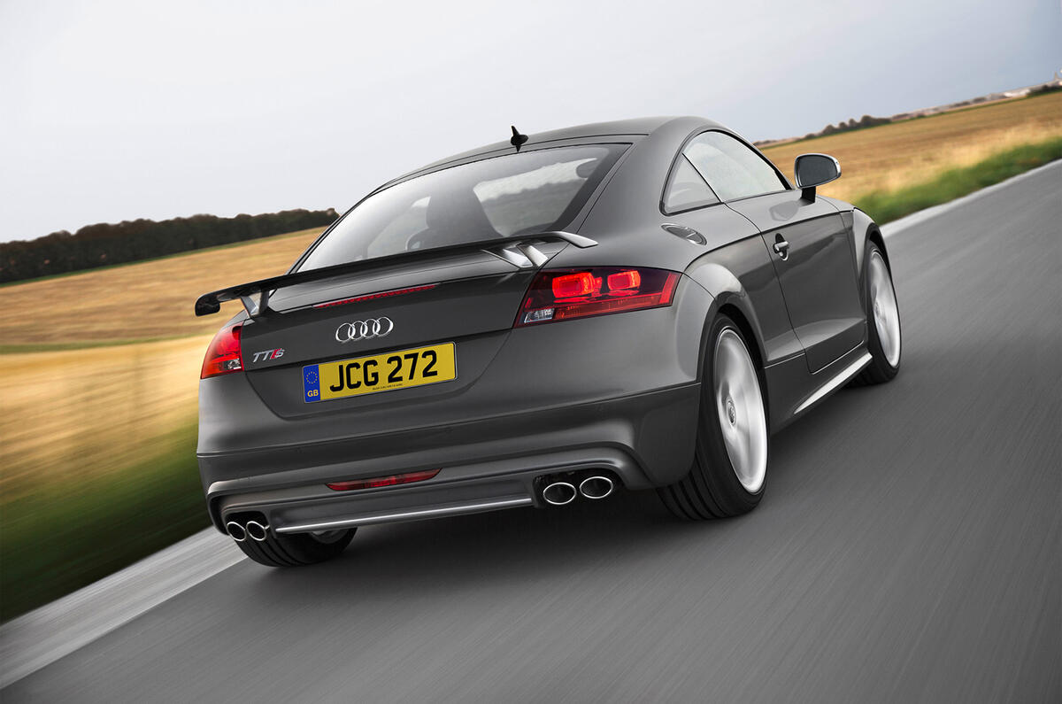
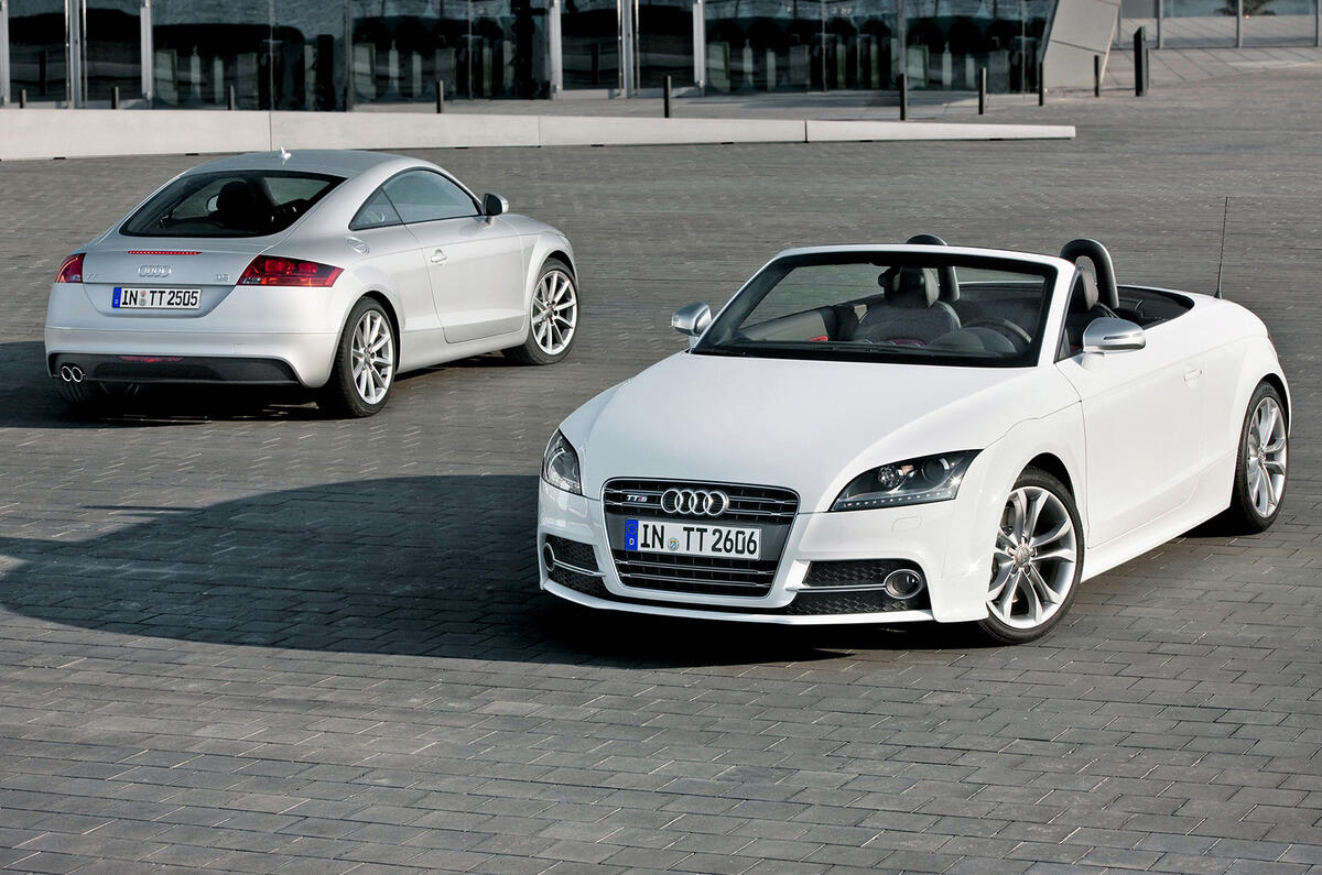
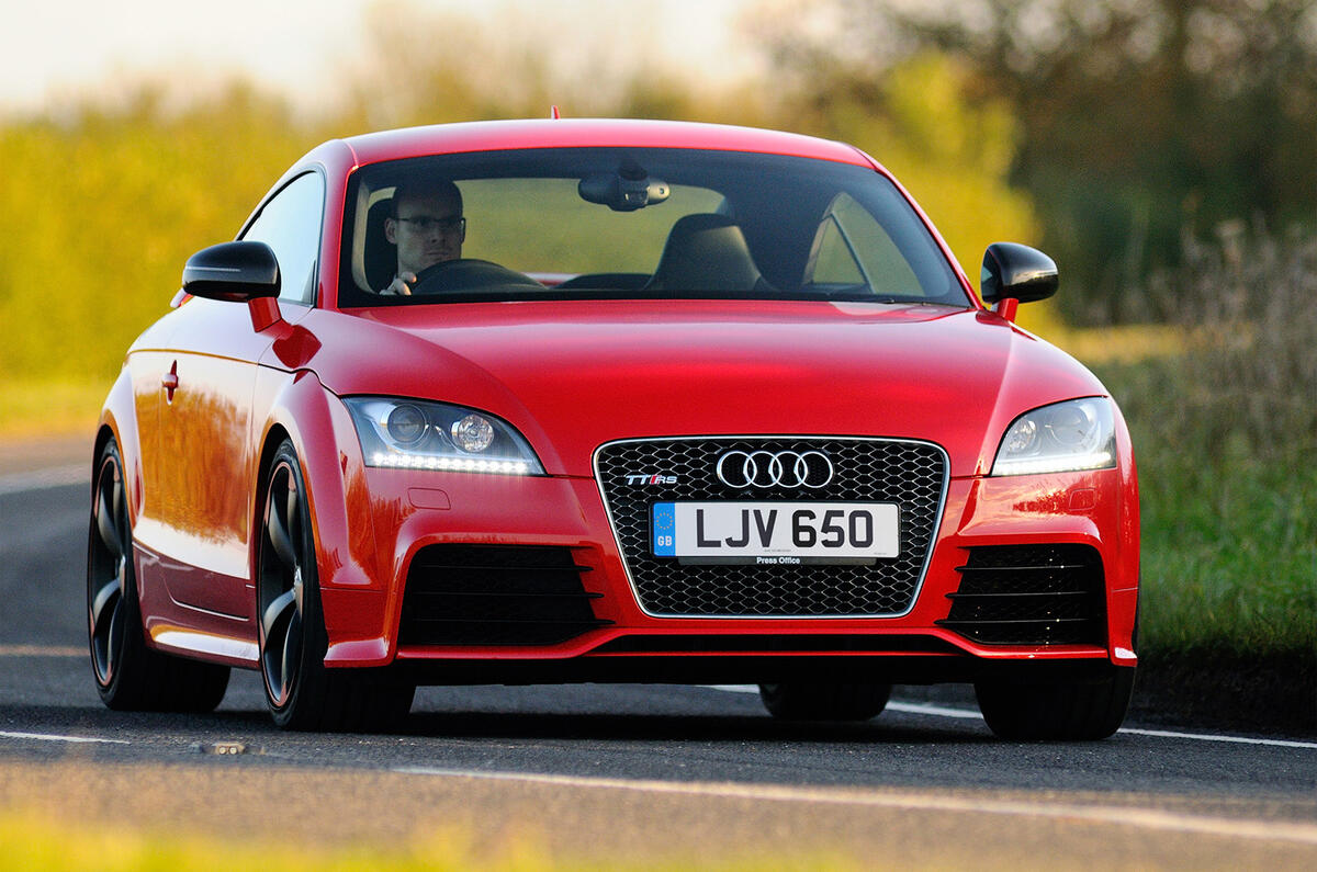
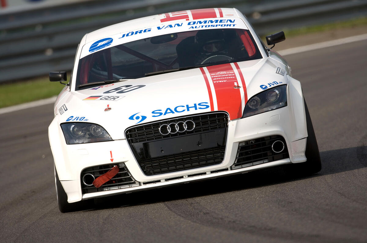
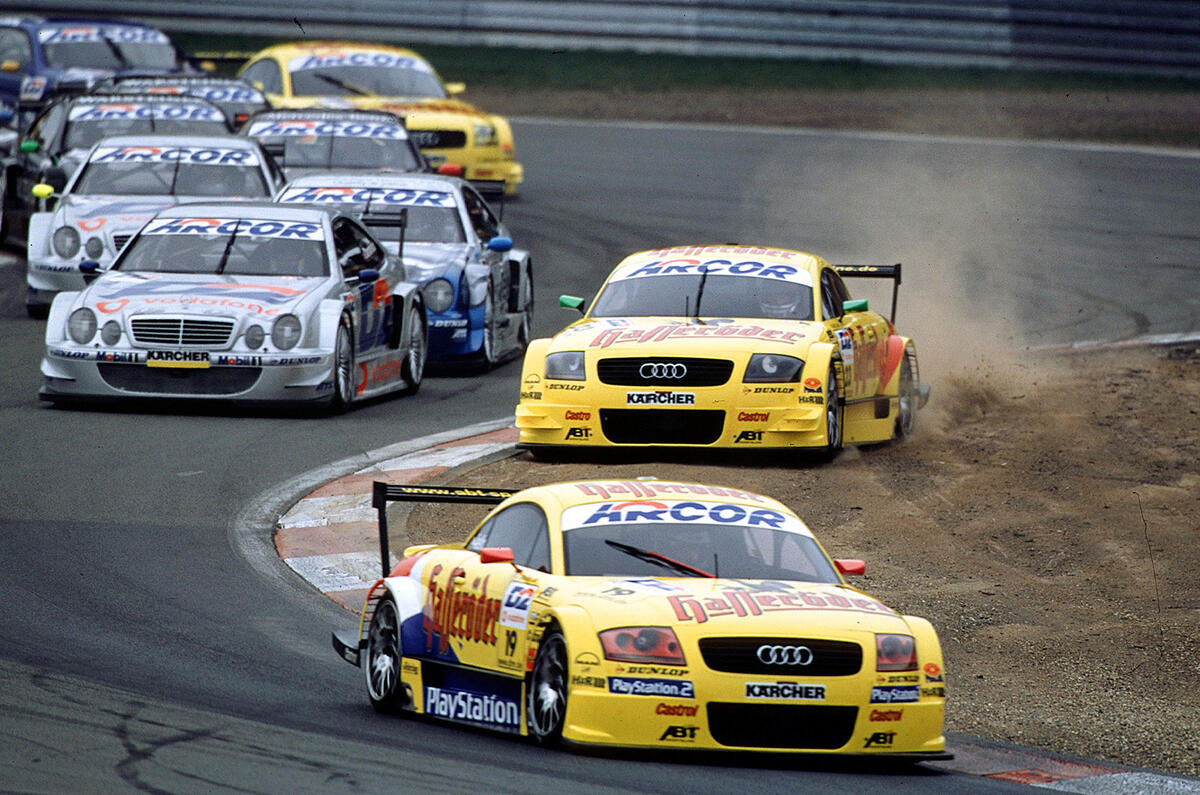
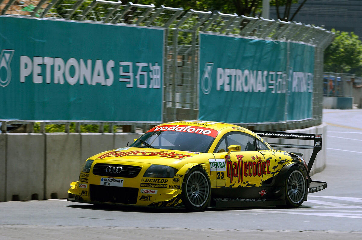
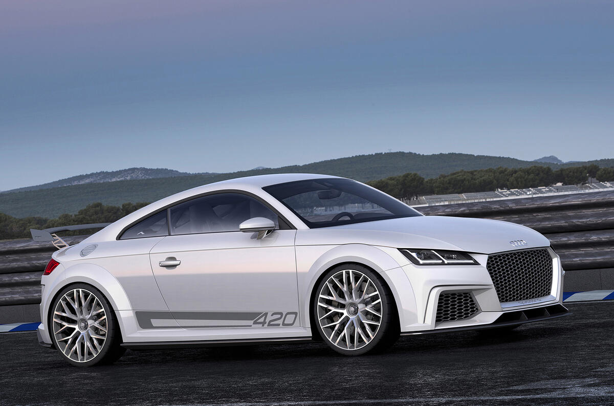
It won’t take much more than a glance, if you’re familiar with the look of the first two generations of Audi TT, to see that this third iteration has pretty strong visual links with the first.
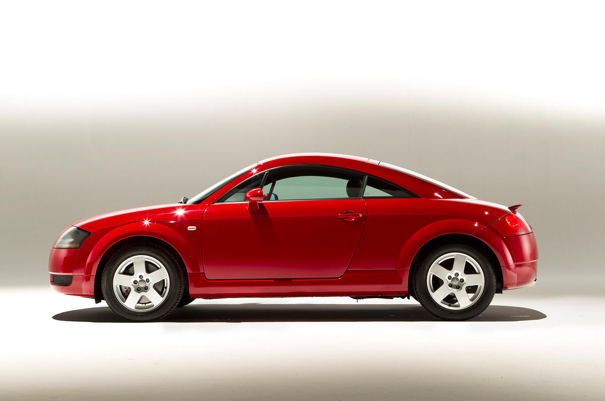
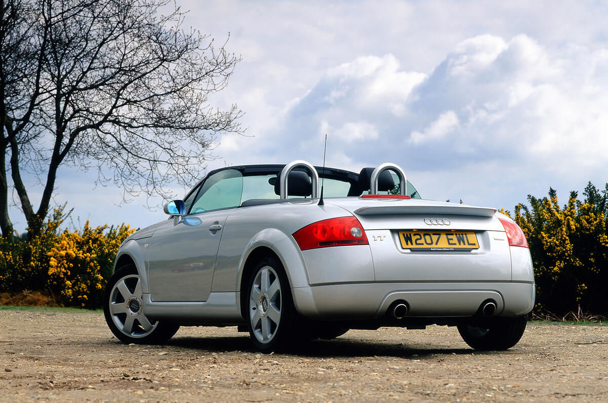
That 1998 TT caused a small storm of desire and did much to reinvigorate interest in coupés. It was, says Audi exterior project designer Dany Garand, “a sports car with uncompromising form language. The 2006 car was more integrated into the Audi form language”.
“The original 1998 model,” he explains, “had a strong geometric form, and was quite symmetrical front to back”. For this version “we wanted to keep the geometric form, but lose the front-to-rear symmetry because it’s a sports car and it needs to look dynamic”.
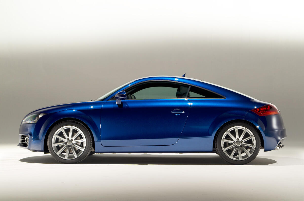
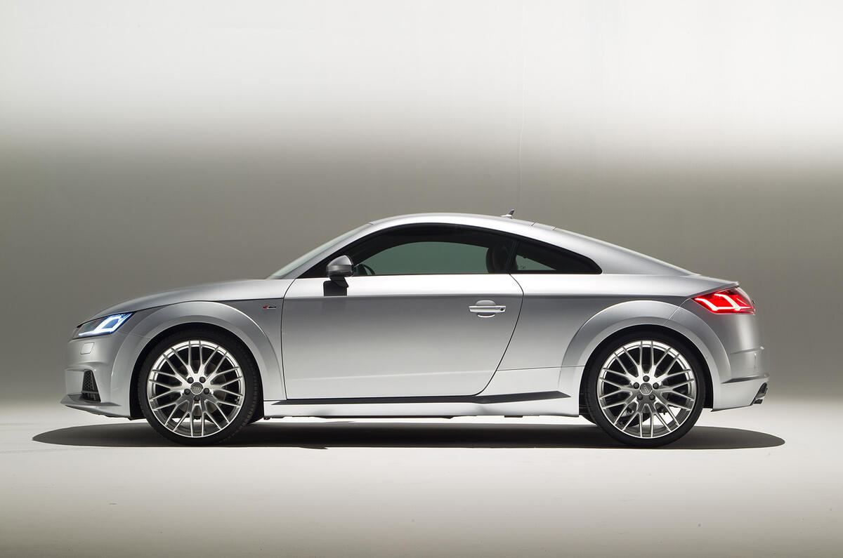
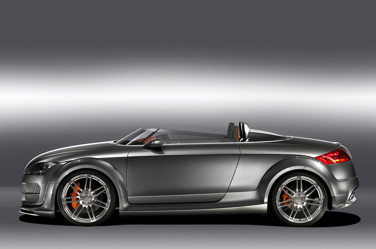
What you’ll recognise from the 1998 car in the 2014 model are “the plant-on cabin, the add-on arches and the sills that are parallel to the ground - the second generation car had a rising sill,’ says Garand.
The plant-on cabin was very much a feature of the first TT, which almost appeared to have a separate hardtop. This look faded somewhat with the 2006 version, whose rear pillars and more gently raked rear screen blended more fluently into its wings. For the 2014 TT there’s more of a kick in the line at the base of the glasshouse, to create a stronger hint of that plant-on look.
“Sperical lines are also very present in the first car,” says Garand. For this TT we’ve made more positive use of geometry than for the previous model, and it has faster lines too. It has fast shoulders, and lots of tension.’ Other very recognisable sculptings from the first car include the flat doors - the 2006’s doors were concave - the curved cut in the bonnet’s shut-line as it crests the wheelarches, and the closer-set pair of exhaust pipes.
The result is a TT that looks closer to the original without going retro, and without completely abandoning the look of the second-generation car. And it’s now even more carefully crafted, Garand pointing to the crisp outer edges of the wheelarch creases, and the final twist of the tornado lines that charge along the Audi’s flanks as they faintly dip towards the ground.
“Isn’t it hard to manufacture a body with that precision?”, I ask him. “Actually, they like the challenge,” he says of his engineering colleagues. Who we can be sure will be challenged again with the fourth-generation TT in eight years' time.

