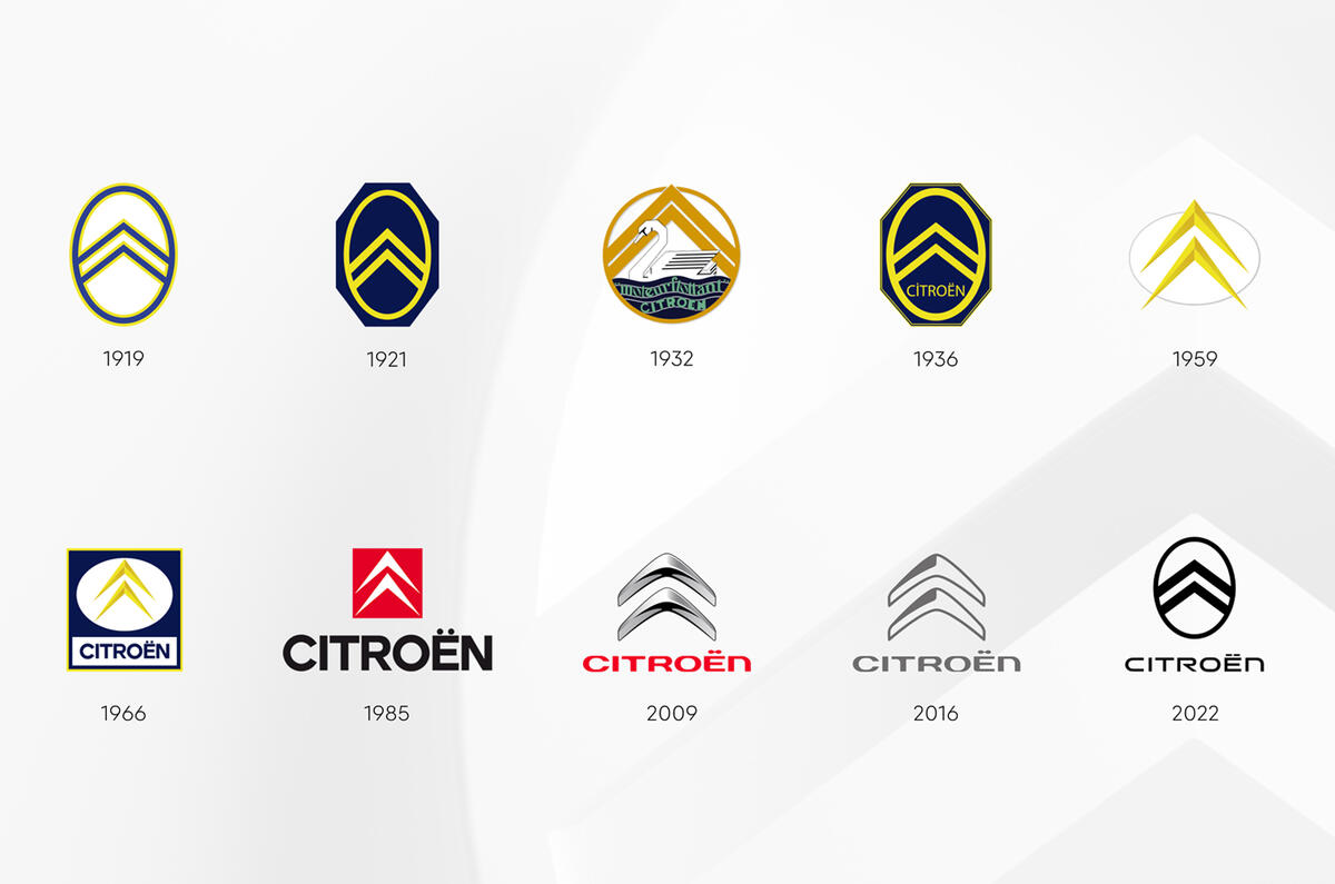
Citroën has revealed a new brand identity reimagining its original 1919 logo for the electric era.
Although the 103-year-old branding was originally coloured navy and yellow, it is now Monte Carlo blue for corporate communications and retail environments. On cars, in print and digitally, it will be infra-red – a more orange shade than is currently used.
The new logo first appeared on the Citroën Oli concept car, a crossover-cum-pick-up signalling the marque's intention to produce affordable, sustainable electric cars in the coming years.
The branding's production debut will be on the next iteration of the Citroën C3 supermini, due in 2023.
Citroën CEO Vincent Cobée said: “As we embark on probably the most exciting chapter in our illustrious 103-year history, the time is right for Citroën to adopt a modern and contemporary new look.
“Our new identity is an elegant symbol of progress as we move our customers physically in daring, forward-looking vehicles that challenge traditional industry rules, and emotionally by ensuring their entire experience – particularly going electric – is more affordable, comfortable and enjoyable whatever their wants and needs.”
On the brand’s new mission statement – ‘nothing moves us like Citroën’ – Cobée added: “Our legacy of inspiring consumers with daring and revolutionary vehicles is energising us to adopt a different, more inclusive approach to future family mobility, and we firmly believe that customers past, present and future will agree that nothing moves us like Citroën.”
The new logo replaces the free-floating dual-chevron design in use since 2009. This has been a prominent feature on Citroën’s cars; flowing into chrome trim spanning the width of the bonnet on current models including the Citroën C3, Citroën C4 and new Citroën C5 X.
The logo was previously shown on 2019’s Citroën 19_19 concept, produced to celebrate the marque’s centenary.
Add your comment